

Axis Davis: Where the Bike Comes to Rest
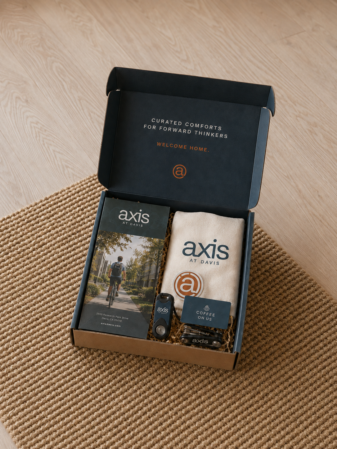
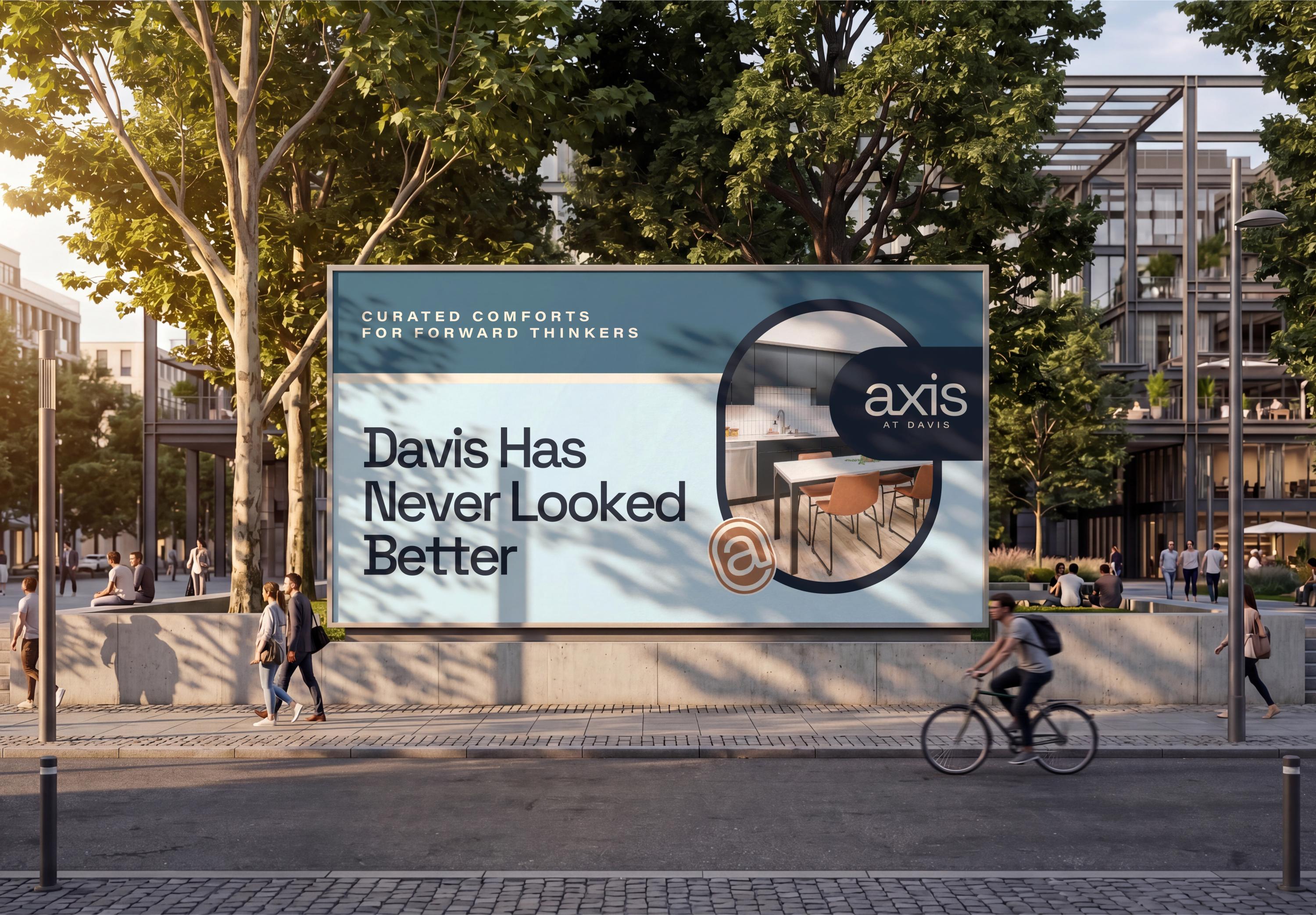
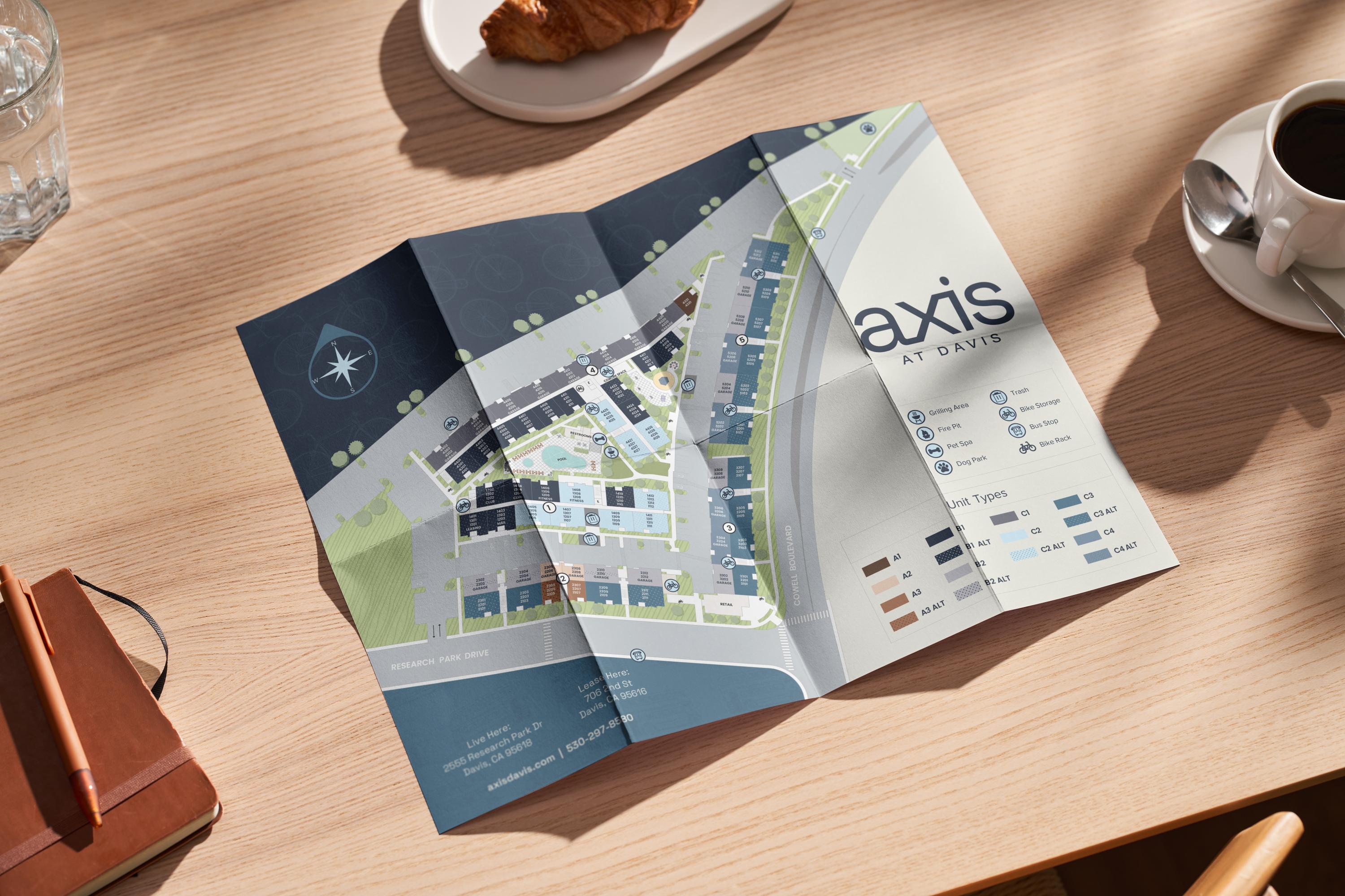
Davis, California is a city defined by its bikes, and that spirit needed to live at the center of everything we built for Axis at Davis. We led the full brand identity for this student housing community, then carried that identity through into a custom website, giving the story one continuous thread from first impression to the digital experience students would rely on to find their next home. This case study covers that process from the ground up, starting with the market visit that shaped our thinking and ending with the logo that grew out of it.
You can Google a market. You have to experience a community.
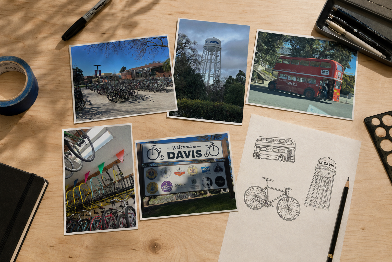
Before any concepts took shape, our team spent time in Davis in person, walking the streets and observing how UC Davis students actually moved through their day. That kind of insight doesn't come from a search. We saw where students parked their bikes, how campus life spilled into the surrounding neighborhoods, and how they talked about their own city when asked. Those observations shaped how the brand should feel before we ever shaped how it should look. Color, texture, tone, even the small supporting design elements all trace back to what we saw on the ground.
The market visit wasn't research for research's sake, it was the foundation the entire brand strategy, and every element built on top of it, was designed around.
Logo Design: A Bike at Rest
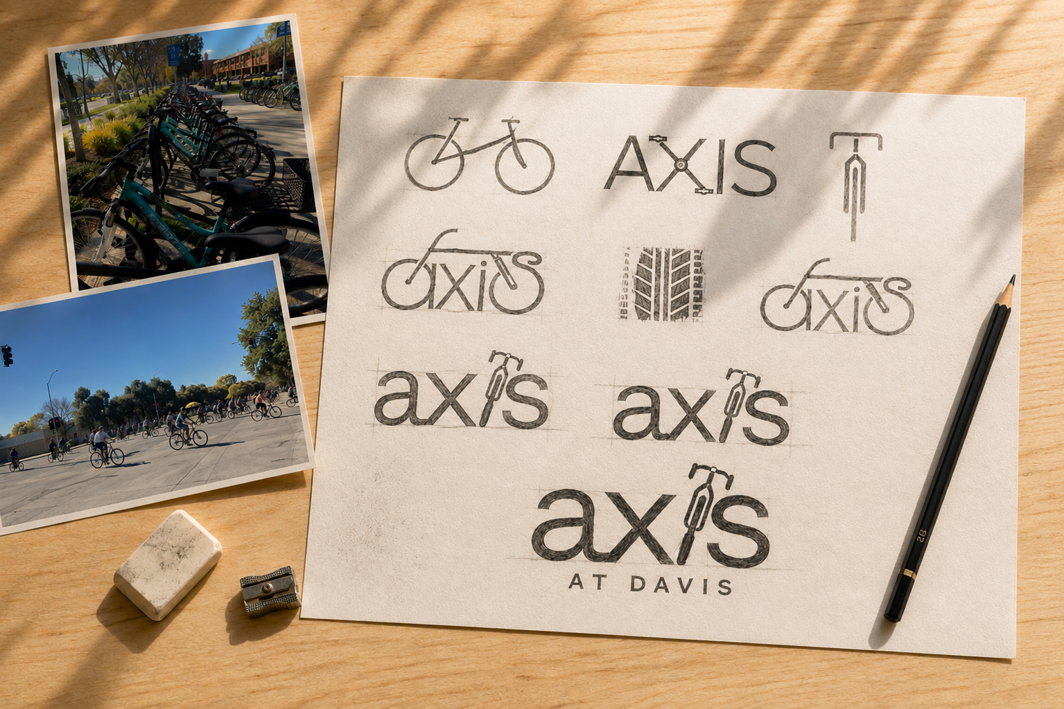
Bike imagery is everywhere in a college town built around bikes, which meant our biggest challenge wasn't finding inspiration, it was standing out inside a visual language everyone already uses.
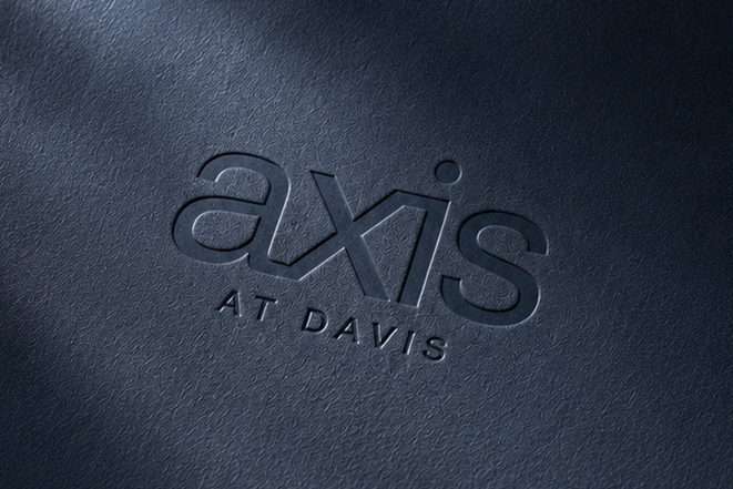
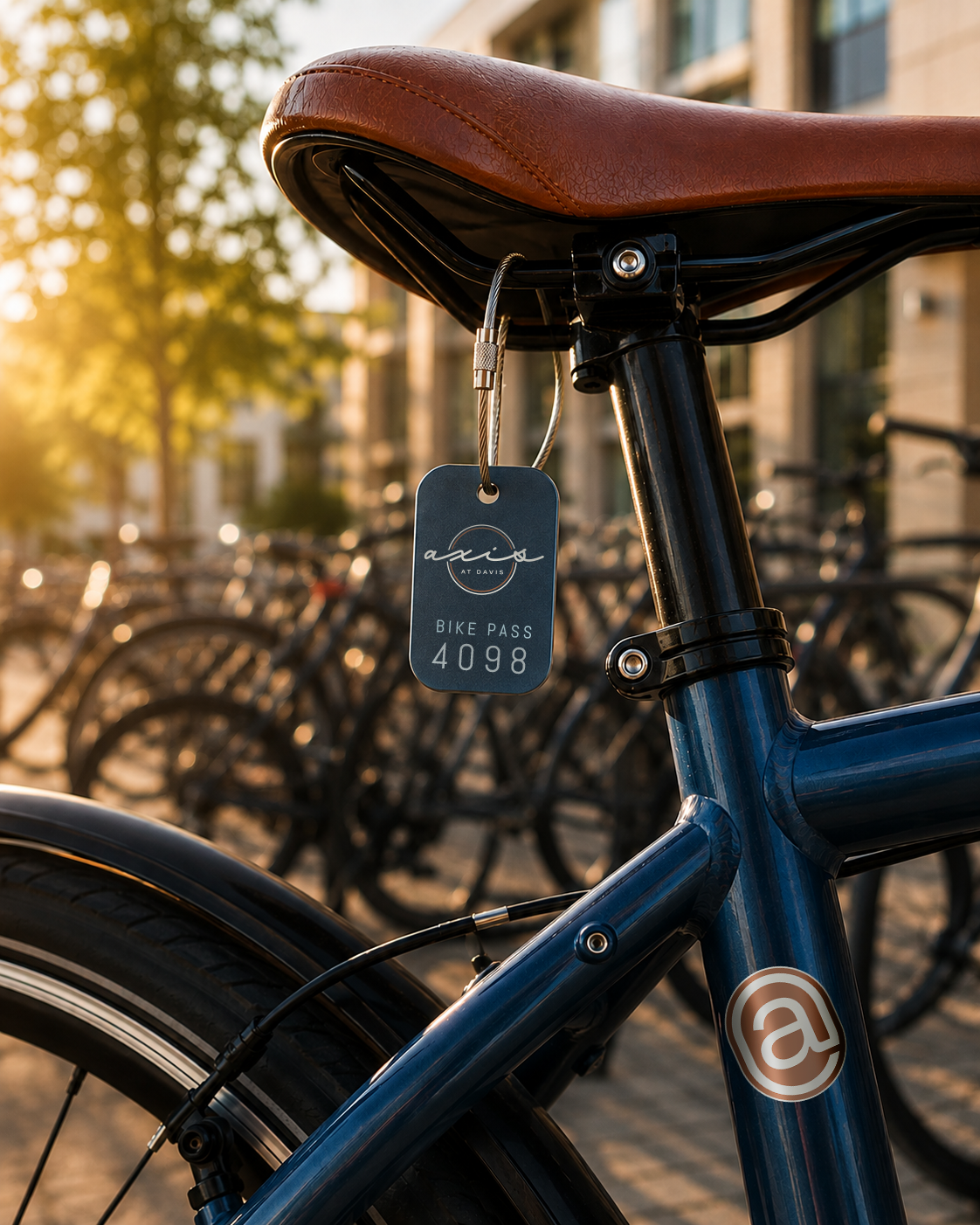
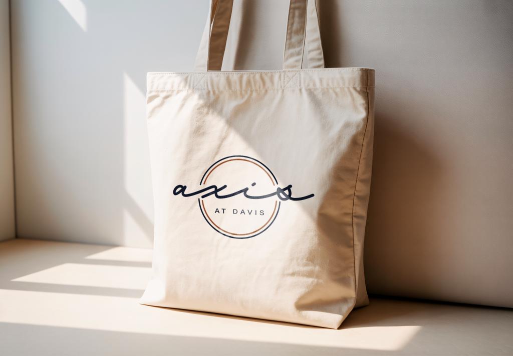
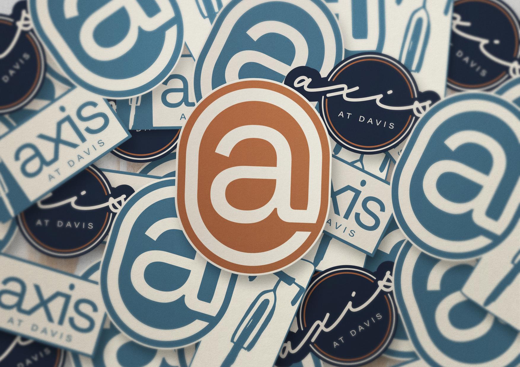
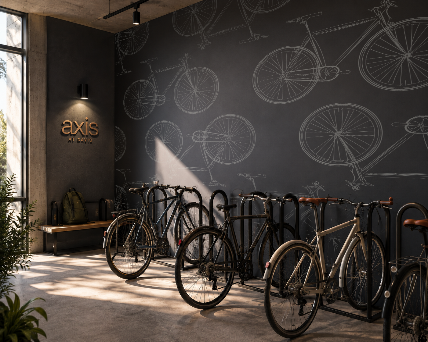
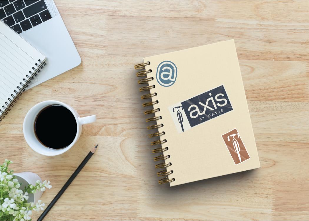
During the market visit, we noticed a pattern across nearly every piece of local bike imagery: the bike was always upright, in motion, ready to ride. That made sense for a city defined by movement. But we weren't designing a brand about the commute to class, we were designing a brand about home, about the moment a student arrives back at Axis at Davis and steps away from the bike for the day. So we flipped the expectation and showed a bike at rest, leaned against a wall. It was a small shift, but it gave the mark a sense of place instead of motion, and it set the logo apart from everything else we'd seen on the street. That same idea of rest and arrival carried through the rest of the brand, shaping a feel that was calm and settled rather than fast and in motion.
Words from our partners
Working with Poetic on the custom brand for Axis was such a great experience because they really spent time learning the market to create something that would resonate specifically with the student body there. It’s given our team a lot of material to work with and continuity across all our marketing platforms where the brand is prominent and stands out against our competitors.
Katy Iwanski
Regional Lease-Up Specialist
Creating a custom website helped Axis stand out in a sea of sameness. Poetic helped us identify where to make an impact with imagery and where to let the let the product do the talking.
Katy Iwanski
Regional Lease-Up Specialist







Let's compose something extraordinary together.
