

Introducing Ellery Lane
This client came to us with Humble Ranch: a name that was technically accurate, but one that said nothing about the life being built there. The community was designed around serene, connected living, the kind of place people put down roots, not just rent a unit. The name needed to say that. We present Ellery Lane: a name and a full brand built to tell that story, from the first impression to the last detail.
The Name
Every name carries a feeling before it says a word. We wanted this one to feel like arriving somewhere familiar, even on the first visit.
Ellery came first. It has a warmth to it, something welcoming and quietly feminine, familiar enough to feel like it was always there, unique enough to stand on its own in the market. Short. Memorable. Easy to say, easy to remember, easy to make yours.
The harder question was what came next. "Ranch" felt too rustic for a community built around individual cottages, each one meant to feel like home. "Community" said the right thing, but said it flatly, the kind of word that describes a place without ever making you feel it.
What we needed was a single word that could hold all of it: a sense of neighbors close by, porches and walkways, the quiet rhythm of a place where people know each other's names. That word was Lane. Quaint without trying to be. Charming without being precious. A word that puts you somewhere specific, somewhere with friendly faces and familiar streets.
Together, Ellery Lane became more than a name. It became the first thing residents feel before they've even walked through the door.
The Brand
A name this specific to a feeling needed a logo that felt handmade, not manufactured.
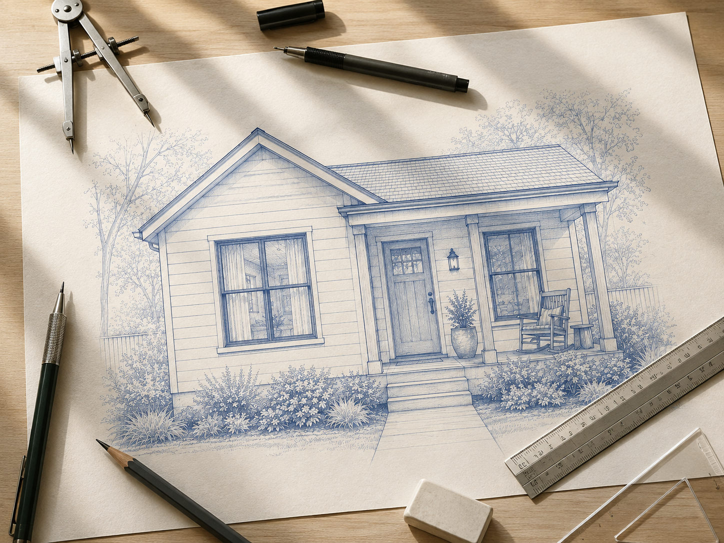
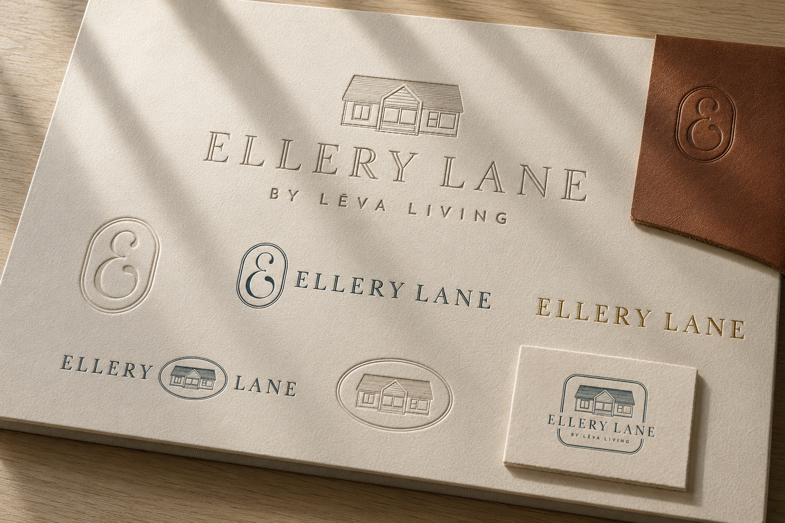
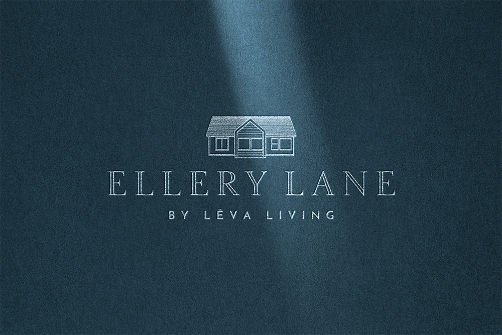
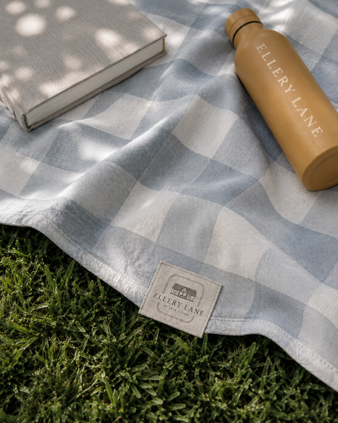
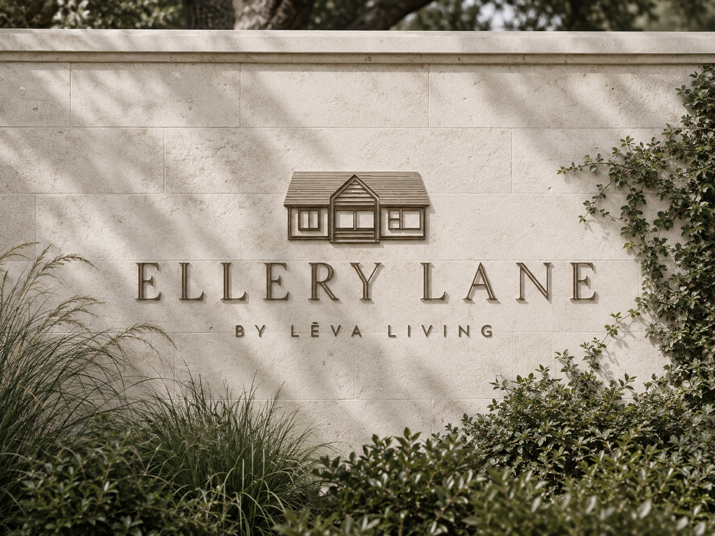
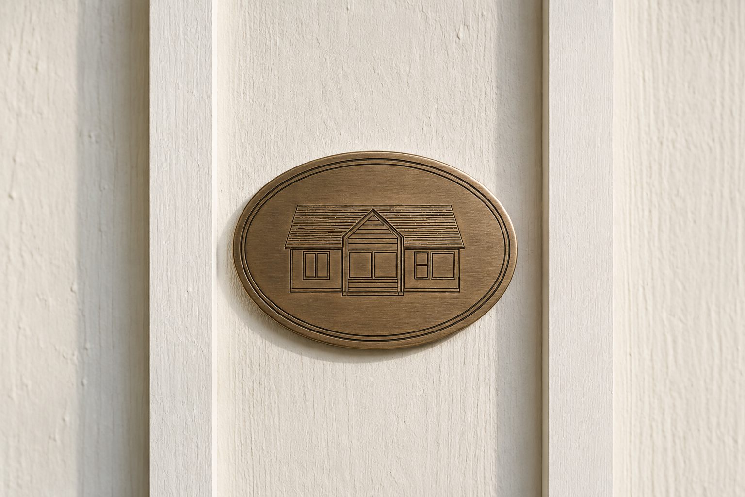
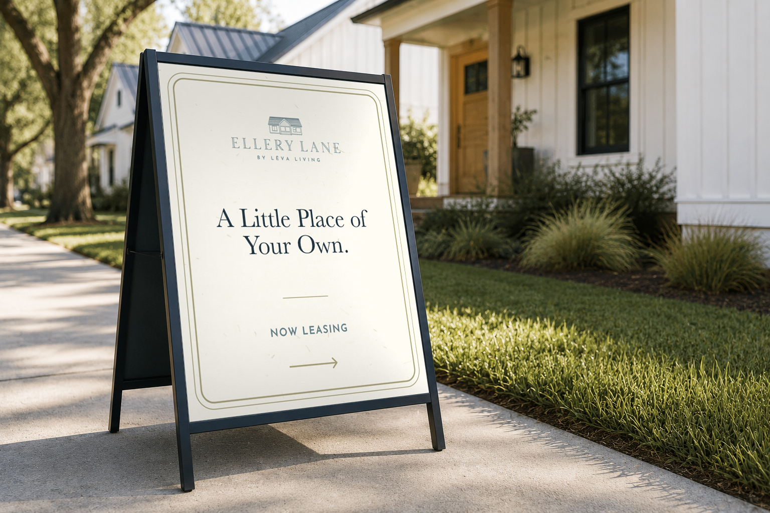
We built the primary logo around two elements that work as one: a serif wordmark, drawn with the kind of quiet elegance you'd expect on a street sign worth slowing down for, and a small illustrated cottage above it. Not a generic house icon, but a specific one, drawn to reflect the individual cottages residents actually live in. It's a detail most people won't consciously notice, and that's the point. It's there for the people who live there, a quiet nod that says: we saw what you're building a life around.
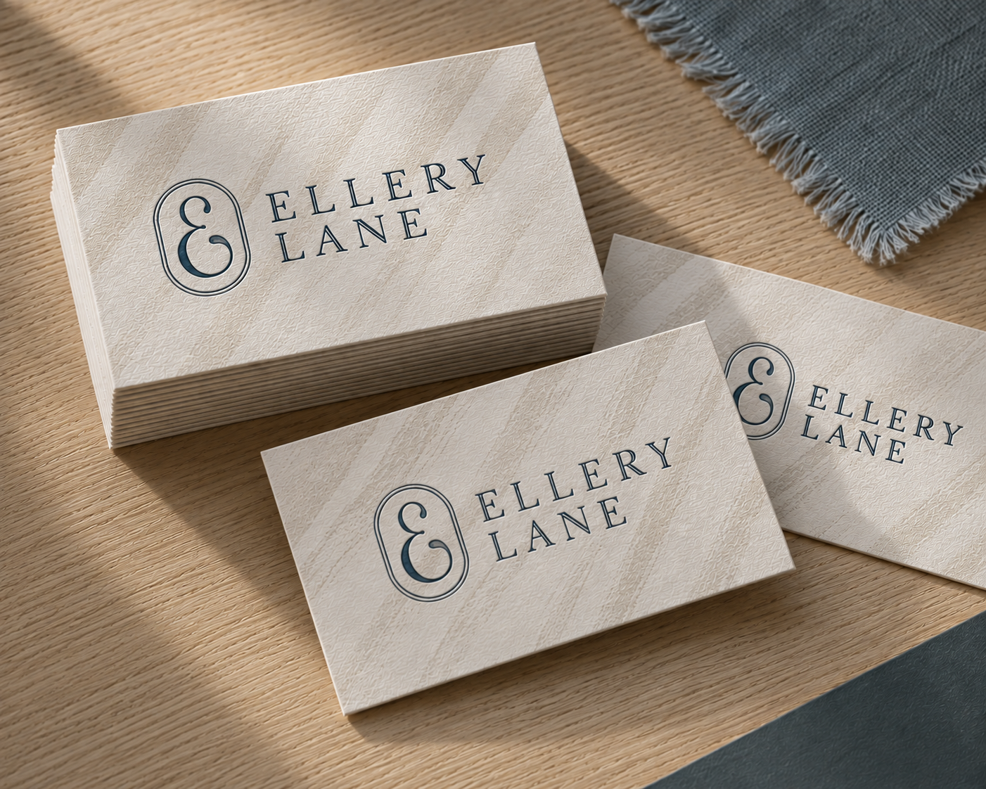
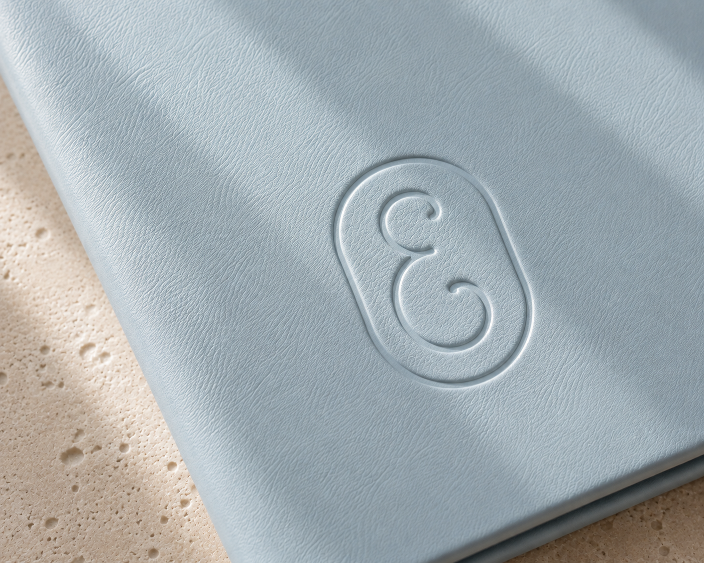
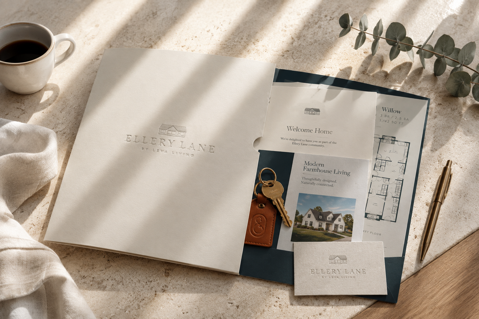
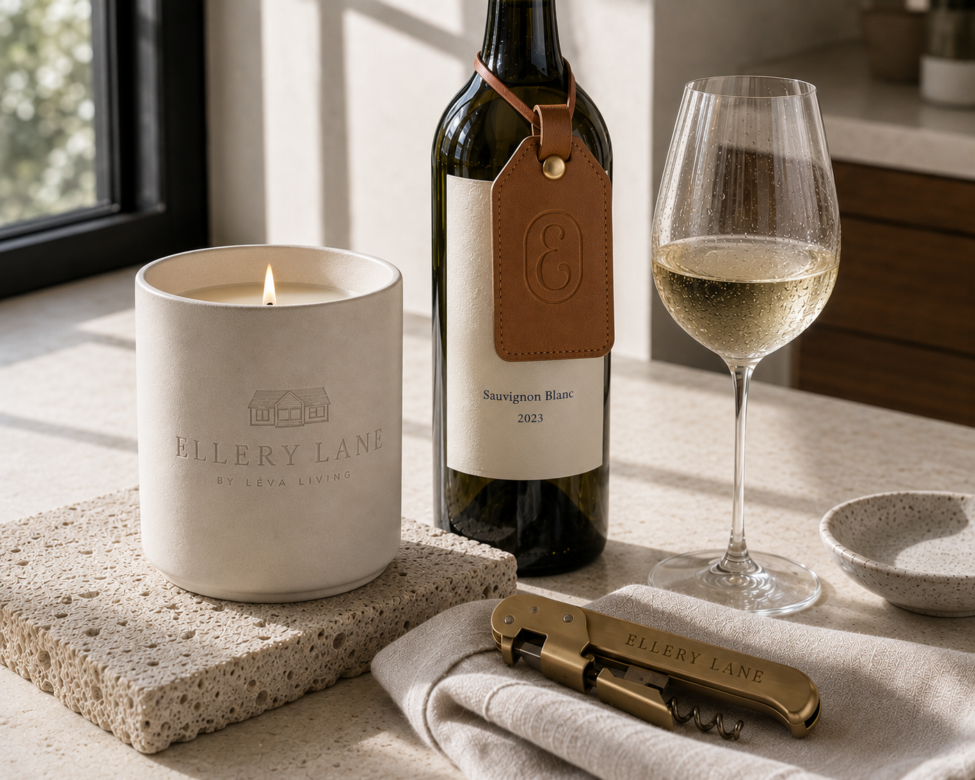
We also designed a monogram: an ornamental "E" set inside an oval frame, borrowed from the same quiet formality as a wax seal or an engraved gate marker. It's the mark that shows up when Ellery Lane needs to say something without saying much: a stamp on a package, a favicon, a detail on a printed card. Small enough to be subtle, distinct enough to be recognized anywhere.
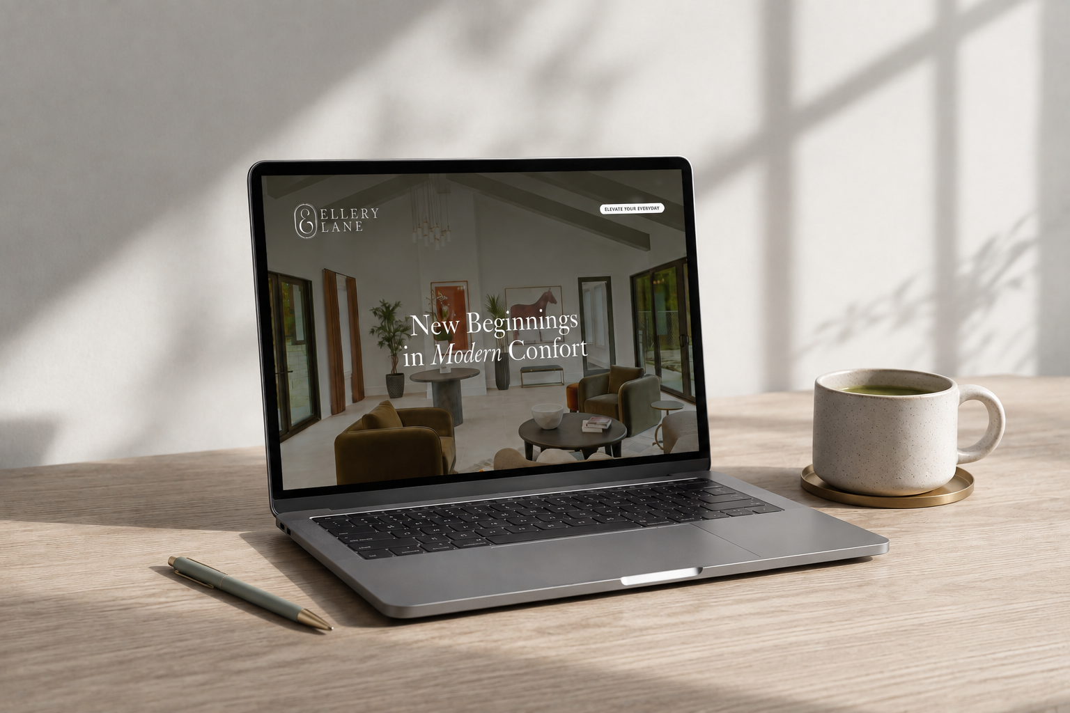
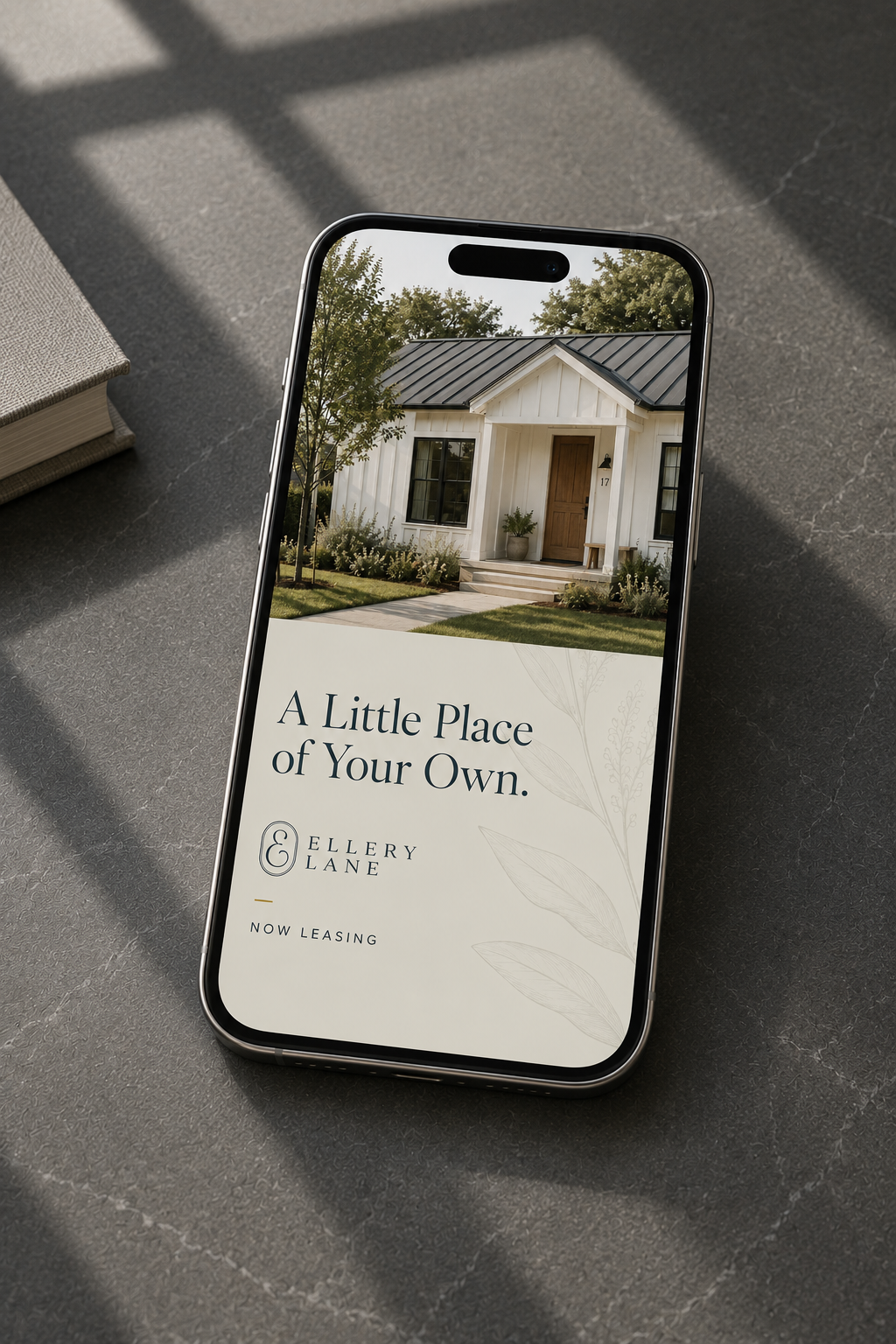
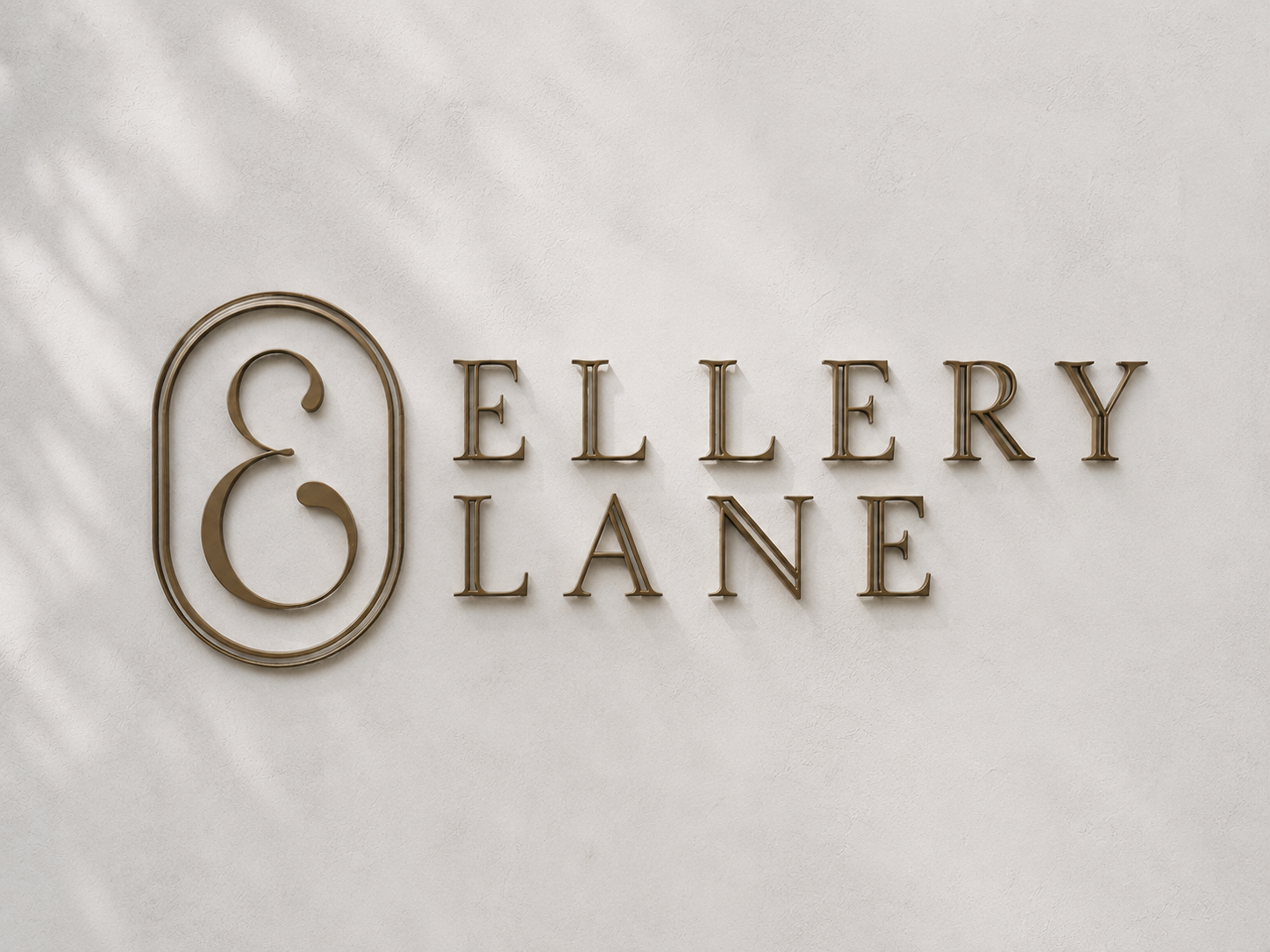
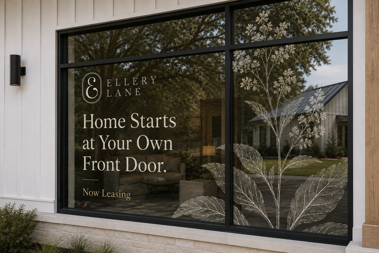
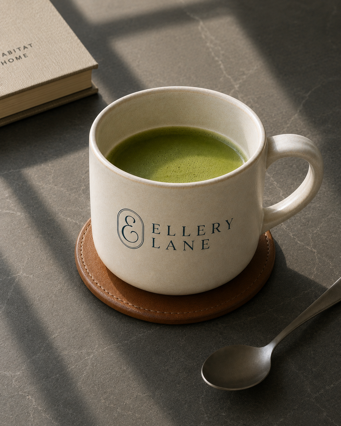
Together, the full suite, the primary lockup, the horizontal version, the monogram, and the badge, gave the brand room to move. A name that started as a challenge became a system flexible enough to live everywhere the community does: on a sign at the entrance, a package left on a porch, a page loading on a phone.
Words from our partners
Lorem ipsomLorem ipsomLorem ipsomLorem ipsomLorem ipsomLorem ipsomLorem ipsomLorem ipsomLorem ipsomLorem ipsomLorem ipsomLorem ipsomLorem ipsomLorem ipsomLorem ipsomLorem ipsomLorem ipsomLorem ipsomLorem ipsomLorem ipsomLorem ipsomLorem ipsomLorem ipsomLorem ipsomLorem ipsom
Lorem ipsomLorem ipsomLorem ipsomLorem ipsomLorem ipsomLorem ipsomLorem ipsomLorem ipsomLorem ipsomLorem ipsomLorem ipsomLorem ipsomLorem ipsomLorem ipsomLorem ipsomLorem ipsomLorem ipsomLorem ipsomLorem ipsomLorem ipsomLorem ipsomLorem ipsomLorem ipsomLorem ipsomLorem ipsom
Lorem ipsomLorem ipsomLorem ipsomLorem ipsomLorem ipsomLorem ipsomLorem ipsomLorem ipsomLorem ipsomLorem ipsomLorem ipsomLorem ipsomLorem ipsomLorem ipsomLorem ipsomLorem ipsomLorem ipsomLorem ipsomLorem ipsomLorem ipsomLorem ipsomLorem ipsomLorem ipsomLorem ipsomLorem ipsom
Lorem ipsomLorem ipsomLorem ipsomLorem ipsomLorem ipsomLorem ipsomLorem ipsomLorem ipsomLorem ipsomLorem ipsomLorem ipsomLorem ipsomLorem ipsomLorem ipsomLorem ipsomLorem ipsomLorem ipsomLorem ipsomLorem ipsomLorem ipsomLorem ipsomLorem ipsomLorem ipsomLorem ipsomLorem ipsom

Let's compose something extraordinary together.
